
One site really dislikes the Suns court design
Sep 12, 2014, 4:18 PM | Updated: 4:18 pm

Grantland.com recently put out an obscure set of power rankings — those of the NBA court design kind.
The criteria for which is briefly explained by the author, Zach Lowe:
The rankings are subjective, though I’ve consulted with sources across the league just for the fun of it, gotten my hands on some exclusive mock-ups of designs set to be unveiled this season, and even chatted with some court designers.
And, sorry to burst your high hopes for the rankings, but the Phoenix Suns did terribly in Lowe’s eyes. Very, very terribly. Second-to-last terribly.
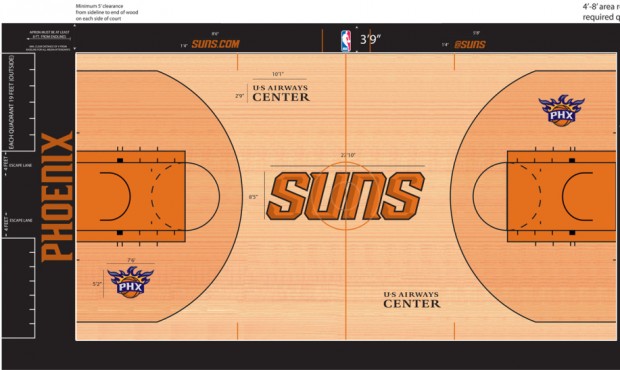
With only the Cleveland Cavaliers finish worse in Lowe’s eyes, the writer explains his beef with the US Airways Center floor:
This is a court design tragedy, considering some of the creative gambles that came before it, including this bad boy from the 1990s. When you have that pretty shade of purplish blue in your color scheme, there is no justification for phasing it out and making it Halloween 365 days a year.
One cool quirk: The designers matched up the “u” and “n” in the center-court logo so that it reads “Suns” from any viewing angle. But only Cleveland’s central logo stretches farther in the direction of each baseline, and I prefer my logos more contained. Subtract points for the two-toned thing. At least the Suns have found a sliver of space for the flaming basketball emblazoned with “PHX.”
Now, brace yourself. You’re not going to like this…
The Los Angeles Lakers came in first on Lowe’s list.
Browse the complete rankings here.


Comments