Oregon’s uniforms for 2018 are wacky as usual but cleaner
Aug 16, 2018, 8:55 AM


The Oregon Ducks always bring it when it comes to an ahead-of-the-curve uniform game.
Their 2018 look uses a usual twist of bright colors schemes with a few new tweaks that actually might make watching the Ducks a bit easier on the eyes this upcoming football season.
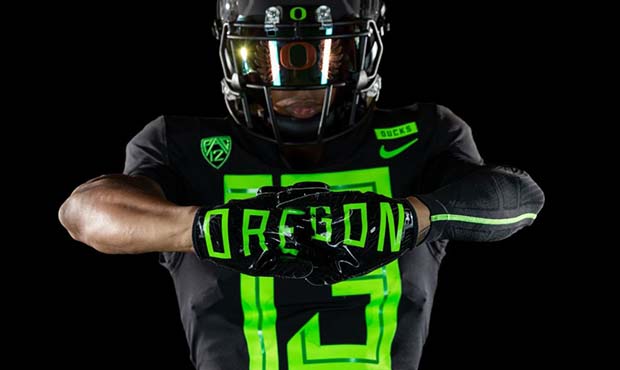
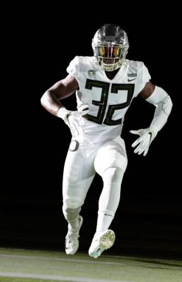
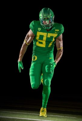
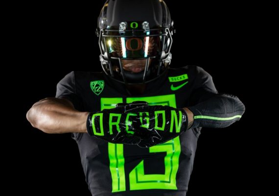
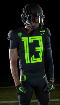
Back are the winged helmets in four color varieties to match their respective jerseys. The biggest changes come with the jerseys.
On the fronts of Oregon’s jerseys, the numbering has taken on a much larger size of font compared to last year’s look. A thin stenciling runs down the middle of the blocky lettering to break up the bigger numbers.
Welcome to @OregonFootball 2.0. #GoDucks pic.twitter.com/ZYs68OS6tO
— Mario Cristobal (@coach_cristobal) August 16, 2018
And on the backs of the jerseys, the Ducks have seemingly found a way to make name plates pop. Just a guess until we see them in person, but the readability has improved. Names will be the same color as the base jerseys but stand out with an off-color, rectangular nameplate around the lettering.
Noticeably, the new jerseys lack much piping or the duck wings that busied the shoulder-pad areas of last year’s set. It’s a much more simplified look.
Oregon released four color schemes: green with yellow numbering, white with black numbering, yellow with black numbering and black with glowing green numbering. That last color-combo should do its best work for #Pac12AfterDark in 2018.