
Coyotes jerseys among ugliest
Jun 10, 2011, 3:23 PM | Updated: 9:09 pm

The days of wearing jerseys solely to identify teams are long gone.
Jerseys are now a fashion statement. People wear them almost everywhere they go and not always because they are fans of the team or the player, but because the color scheme matches the rest of their outfit or the logo looks cool.
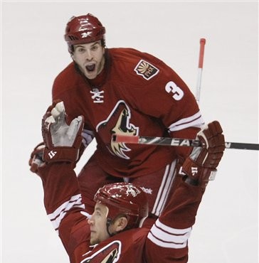
Business Insider recently ranked the 15 ugliest uniforms in sports history, and the Phoenix Coyotes came in at number 14.
While some say these are not even the worst uniforms the Coyotes have ever had, Business Insider had a different take.
No wonder they are having attendance issues. The coyote on the front of the jersey looks it is yawning, which is not the fiercest thing a coyote has ever done. The solid red uniforms are uninspired, and an expansion era hockey team can’t go for the traditional hockey uniform look simply because there is nothing vintage about them.
While we fail to see the correlation between ugly jerseys and low attendance, the Phoenix uniforms do leave a lot to be desired.
Business Insider maligns the Coyotes for their “uninspired” uniforms, but plain jerseys are not necessarily a bad thing.
Creativity in uniform design would be nice, but sometimes creativity is taken too far, as evidenced by the No. 15 team on this list, the Oregon Ducks.


Comments