The time to change for Arizona State athletics is now
Apr 12, 2011, 11:43 PM | Updated: Apr 13, 2011, 12:02 am


For the past two weeks Arizona State University has been running with the slogan “it’s time.”
The time came on Tuesday afternoon with the unveiling a new logo, a new brand, a new color and new uniforms.
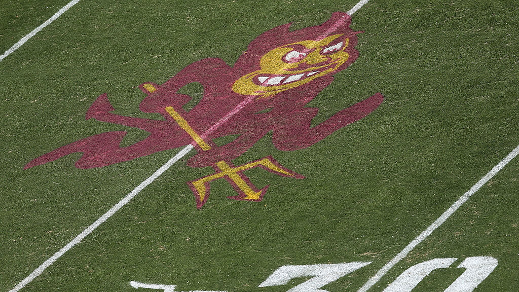
The new logo: The Sun Devil Pitchfork will be the primary representation for identifying Arizona State athletics. It is a fierce looking gold fork outlined in maroon with sharp edges — the prongs of the pitchfork are symbolic, representing integrity, winning and scholarship. The fork goes either straight up and down or angling up as it does on the football helmets. Also, part of the new logo is the font, Sun Devil Bold. The font brings block letters to the forefront and gone will be the script letters.
The new brand: Multiple ideas were brought to the rebranding of Sun Devils Athletics. This focus will bring all the teams together with consistent colors, font and logos.
“When I arrived at ASU six years ago I noticed we were an athletics program which featured different shades of maroon and gold, different logos, multiple fonts and uniforms,” Arizona State University Vice President of Athletics Lisa Love said in a press release. “There was a lack of real consistency with regard to our brand.”