It’s Time, to go back to the drawing board
Apr 13, 2011, 5:23 AM | Updated: 5:36 am

Talk about disappointing. No not the Suns. No not the Cardinals. No not Espo’s complete over use of argyle. I’m talking about the Sun Devils new look.
I am a jersey dork. I like to love a good one, and I love to hate others. (And I hate all basketball jerseys so we don’t even have to talk about those. Who wears tank tops? Really? Go back to Jersey Shore.) When I heard that Arizona State Athletics was rebranding their entire department I got really excited. When I heard they were teaming with Nike I got even more excited. For all the bad jerseys Nike has done, their core uniform strategy is very solid.
When I first saw the new look Sun Devils I was not impressed. Boring. That is all I could think. I was shocked. How could Nike and ASU be put together and get boring? It’s unimaginable. There are signs of life; I like the addition of black to the color scheme. Actually making it part of the scheme and not just adding it to the uniforms is great.
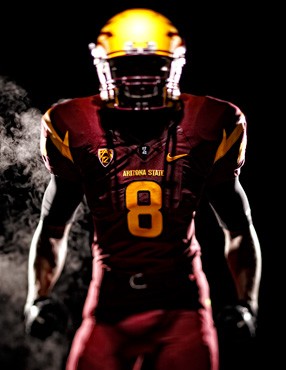
I’m going to focus on the football uniforms because, let’s face it that is all anyone is going to care about. And it wasn’t all bad.
The Helmets are great. The flat color is a newer look that is really catching on, and I love it. The new logo I’m not to hot on, but on the helmet it looks amazing. I like the size, the orientation and the little shimmer the logo has to make it stand out from the flat paint scheme. I would like to have seen a maroon and a white to see what they could have done with those, but I wouldn’t be surprised if those are out there. It is Nike afterall.
The Uniforms
I’ll say this; the only things I like are the “PT42” and the idea of the trident spikes on the arm. And I say idea because I don’t think they were executed properly, they leave too much blank area. On top of the shoulders it looks empty. The trident prongs with the “ASU” under them clutters the sleeve, and I really don’t see a point with putting “ASU” on the sleeve. Especially with no outline, it makes it look like cheap iron on from youth football days. And I think these jerseys are just too plain.
Normally I like a clean look but it seems like everything is on the shoulders, and there is no detail on the pants, or anywhere else on the jersey. I’d like to see some sort of piping on the pants and underarms of the jersey, or a better logo on the sleeve. There was a lot left to be desired with the design. They could have been much more innovated and not gone as far as the boys in Eugene. Plus, I was kind of hoping to see the modernization of Sun Burst logo.
The logo.
Love the idea. Sparky is too cartoony. Like how Oregon got rid of the Duck Logo. The Pitchfork looks cool. It is a sharp pointed design. Just get rid of the crap coming off the bottom. And if you’re going to put something on the bottom make it flames, you know like from where a Devil would come from with a pitchfork, or the sun. But overall I would say it’s an upgrade over Sparky on the helmet. It does nothing for me as the little accent piece elsewhere on the jersey.
ASU knows that if you want to stay relevant and move forward you might have to make some big changes, and I give them credit for that. It was a bold move, and I think they made some improvements. But hopefully in the next few years with the tweaking and the changing Nike likes to do, they will improve. Now lets see if the University of Arizona follows suit and gets rid of their boring block ‘A’, maybe add a little argyle?