Coyotes roast Timberwolves logo that looks a bit familiar
Apr 12, 2017, 7:04 PM | Updated: Apr 13, 2017, 8:56 am

It feels like every new team logo or jersey reveal brings out the critics.
To be fair, creating a unique color scheme and a new design, and doing so when every other team’s mascot is a type of cat, dog or bird makes these things difficult.
Still, the Minnesota Timberwolves’ new logo revealed on Tuesday too easily looked like a mashup of the Seattle Sounders’ color palette and the Arizona Coyotes’ howling ‘Yote logo.
The T-Wolves introduced the new look with a new motto: “New era. New look.”
New Era. New Gear.
New merch coming this Thursday. Stay tuned. #NewEraNewLook pic.twitter.com/72IXaydzoK
— Timberwolves (@Timberwolves) April 12, 2017
The Coyotes didn’t seem overly offended. Well, we don’t think so.
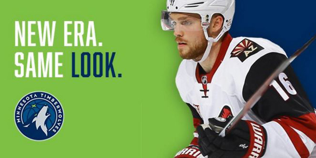
They took the logo drop with a sense of humor, tweeting at the T-Wolves on Wednesday with a little altered text: “New era. Same look.”
.@Timberwolves we like your style. pic.twitter.com/Of0FqXP3yT
— Arizona Coyotes (@ArizonaCoyotes) April 12, 2017
And as would be expected, the internet had some fun with the realization that both Wolves and Coyotes tend to howl with their heads held high.
I guess the Timberwolves rejected this one… pic.twitter.com/JcLi7uS2eU
— Matt Urbas (@Matches10) April 11, 2017
Got an idea for you, @ArizonaCoyotes… pic.twitter.com/JJ9pUuswKt
— Conrad Burry 🔴🐐🎨 (@conradburry) April 12, 2017
According to Google, Coyotes yip-howl, yap and bark. So there's the major difference between the @ArizonaCoyotes and @Timberwolves logos. pic.twitter.com/oG2WKGrQYd
— Terry Horstman (@terryhorstman) April 12, 2017
. @Timberwolves – "hey @ArizonaCoyotes can we borrow your homework"
Coyotes – "yeah sure just change a few things so it looks like yours" pic.twitter.com/pLeQPI1vns
— Matt Hunter (@GNB79) April 12, 2017
Minnesota Timberwolves, Rouyn-Noranda Huskies, Arizona Coyotes.
Who wore it better? pic.twitter.com/JP2Ub1opVN— Mike Johnston (@MikeyJ_MMA) April 12, 2017